Simplified Financial

Reconciliation.

← Back to All Work

Role

UX Designer

timeline

3 Months

SKILLS

STAKEHOLDER WORKSHOPS

Affinity Mapping

Object-Oriented UX (OOUX)

REQUIREMENTS DOCUMENTATION

WIREFRAMING

DEVELOPER HANDOFF

When trust breaks down over data, how can design rebuild it?

When our client’s auditors set out to identify discrepancies between sold products and earned commissions, they relied on a reconciliation tool that was anything but intuitive. The process was manual, opaque, and difficult to track, ultimately costing the business both time and money.

Over two days of in-person stakeholder workshops, we aligned on the critical business needs and kicked off an Object-Oriented UX (OOUX) discovery to untangle the system’s complexity. From there, I collaborated with auditors to create wireframes and workflows that made inconsistencies easier to spot, resolve, and monitor throughout the process.

After rounds of feedback from auditors and stakeholders, we handed off the final design to developers with clear documentation, paving the way for a smarter, streamlined reconciliation experience—and major savings.

1

Stakeholder Alignment

PROJECT PLANNING WORKSHOP

We kicked off the project with a virtual planning session to align on goals, clarify deliverables, and build a shared understanding of our timeline. Together with our client, we mapped engagement activities to a shared project calendar and identified key stakeholders. A technical walkthrough of the current-state process with an experienced auditor gave us our first glimpse into the complexities of the system and where the pain points existed.

SOLUTION VISION WORKSHOP

To deepen our understanding of the problem space, we brought the full project team together for a two-day in-person workshop. This included auditors, developers, project managers, and our design team.

Our goal: align on the business value, define project goals, and build consensus around what success would truly look like.

AFFINITY MAPPING

Through a series of collaborative activities—stakeholder mapping, 5 Whys, success and failure definitions, and dot-voting on features—we uncovered core user needs and clarified the challenges ahead. By the end of the session, we had the momentum and alignment we needed to move forward confidently.

PROJECT PURPOSE

We aim to create a streamlined reconciliation system that matches data accurately, efficiently, and reliably so that we can identify and recover the discrepancies that are not currently paid out. 

2

OOUX Discovery

BREAKING DOWN THE BASICS

Armed with our workshop findings, the design team began the process of noun foraging, a key Object-Oriented UX (OOUX) activity. We combed through transcripts, documentation, and audit reports to identify potential “objects” that could serve as the building blocks of the system.

We asked: Does this have structure? Does it serve a purpose? Can we identify individual instances?

After synthesizing our findings, we brought a candidate list to the auditors. Together, we distilled it down to the core components of the reconciliation system:

Invoices, Reports, Line Items, Discrepancies, and Matching Logic.

SysTEM MODELING

With our objects defined, we facilitated system modeling sessions with users to map relationships and workflows. These sessions helped us visualize how objects connected across the auditing process, aligning the team’s mental model with the data model.

This exercise proved invaluable in simplifying a highly complex workflow into digestible, actionable steps.

UNDERSTANDING ACTIONS

We then identified the primary user roles—Admins, Auditors, and Field Employees—and mapped the specific actions each role needed to take on every object. This ensured our system supported the right capabilities for the right people at the right moments.

3

Defining Requirements

ATTRIBUTE MAPPING

Next, we dove into the details of each object through attribute mapping. We collaborated with the team to define and prioritize attributes by their function—core content (yellow) and metadata (pink)—to ensure consistency and clarity.

For instance, for the object Line Item, we defined attributes such as status, customer name, and associated discrepancies. These were used to guide sorting, filtering, and interaction design on both the list and detail views.
OBJECT GLOSSARY & REQUIREMENTS

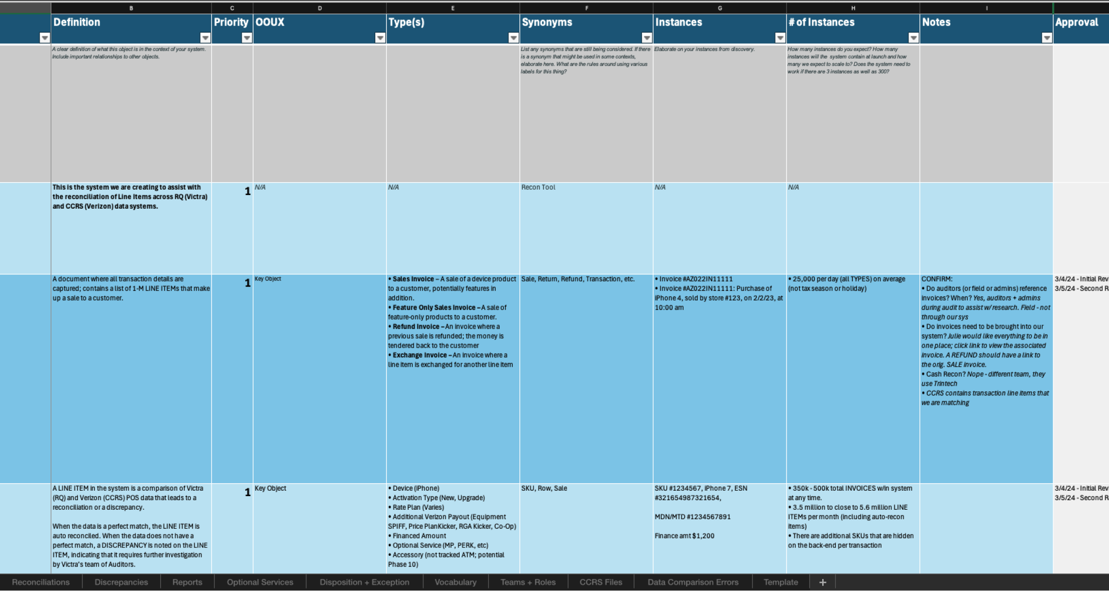
To anchor our complex domain in shared understanding, we led virtual workshops with auditors to create an Object Glossary. For each object, we captured:

• Definitions and synonyms

• Attribute types and priorities

• Instance examples

• Roles with access

• Ownership and success criteria

• Purpose and content strategy

We also mapped out object relationships—defining cardinality, filtering/sorting logic, and interaction mechanics.

This living glossary became our single source of truth, aligning stakeholders and reducing ambiguity as we transitioned into design.

4

Visualizing the Design

FROM OBJECT MAP TO HIGH FIDELITY DESIGN

With fully defined objects and attributes, we moved into design. Using OOUX wireframes, we created intuitive layouts where every element—content, buttons, structure—was grounded in user priorities and object relationships.

Wireframes mirrored our object maps:

• Cards displayed key attributes

• Detail views revealed full content and metadata

• Contextual actions were placed where users expected them

For example, the Line Item row followed our object priority and served as the foundation for a table auditors could easily sort, scan, and filter.

FROM OBJECT MAP TO HIGH FILDELITY DESIGNS

Once our wireframes were validated, I applied visual design elements to produce high-fidelity mockups. Because the structure was rooted in object logic, we were confident the interface would scale well and support real-world complexity while remaining intuitive for users.

FROM OBJECT MAP TO HIGH FILDELITY DESIGNS

One of the most critical interfaces was the Line Item Detail Page, where auditors could:

• View discrepancies

• Understand unmatched attributes

• Take corrective action

• Document plans to reconcile the data

The layout followed our OOUX foundation, making even dense information easy to interpret.

FROM OBJECT MAP TO HIGH FILDELITY DESIGNS

At the end of our engagement, the client praised the clarity, organization, and scalability of the design system, and how much ground we were able to cover within the engagement window.

FINAL THOUGHTS & BIG WINS

Although this was just the first phase, our work laid a strong foundation for development. The team walked away with a clear model of their system, a shared language, and confidence in the direction ahead. Some of our biggest wins:

Shared Language Across All Teammates

OOUX helped auditors, designers, developers, and project managers communicate with precision—using consistent terminology that reduced misunderstandings.

Complex Concepts Made Intuitive

By breaking the system into objects and attributes, we turned abstract auditing logic into visual, interactive components that users could easily engage with.

Grounded Design Decisions

Every button, layout, and table was backed by structured research—giving the client confidence that designs would meet both business and user needs.

Aligned UX and Dev Teams

The shared system model helped developers plan ahead and think modularly, accelerating implementation and improving cross-functional collaboration.

Let’s make

something together

Simplified Financial Reconciliation.

← Back to All Work

Role

UX Designer

timeline

3 Months

SKILLS

Object-Oriented UX (OOUX)

Affinity Mapping

REQUIREMENTS DOCUMENTATION

STAKEHOLDER WORKSHOPS

WIREFRAMING

DEVELOPER HANDOFF

When trust breaks down over data, how can design rebuild it?

When our client’s auditors set out to identify discrepancies between sold products and earned commissions, they relied on a reconciliation tool that was anything but intuitive. The process was manual, opaque, and difficult to track, ultimately costing the business both time and money.

Over two days of in-person stakeholder workshops, we aligned on the critical business needs and kicked off an Object-Oriented UX (OOUX) discovery to untangle the system’s complexity. From there, I collaborated with auditors to create wireframes and workflows that made inconsistencies easier to spot, resolve, and monitor throughout the process.

After rounds of feedback from auditors and stakeholders, we handed off the final design to developers with clear documentation, paving the way for a smarter, streamlined reconciliation experience—and major savings.

1

Stakeholder Alignment

PROJECT PLANNING WORKSHOP

We kicked off the project with a virtual planning session to align on goals, clarify deliverables, and build a shared understanding of our timeline. Together with our client, we mapped engagement activities to a shared project calendar and identified key stakeholders. A technical walkthrough of the current-state process with an experienced auditor gave us our first glimpse into the complexities of the system and where the pain points existed.

SOLUTION VISION WORKSHOP

To deepen our understanding of the problem space, we brought the full project team together for a two-day in-person workshop. This included auditors, developers, project managers, and our design team.

Our goal: align on the business value, define project goals, and build consensus around what success would truly look like.

AFFINITY MAPPING

Through a series of collaborative activities—stakeholder mapping, 5 Whys, success and failure definitions, and dot-voting on features—we uncovered core user needs and clarified the challenges ahead. By the end of the session, we had the momentum and alignment we needed to move forward confidently.

PROJECT PURPOSE

We aim to create a streamlined reconciliation system that matches data accurately, efficiently, and reliably so that we can identify and recover the discrepancies that are not currently paid out. 

2

OOUX Discovery

BREAKING DOWN THE BASICS

Armed with our workshop findings, the design team began the process of noun foraging, a key Object-Oriented UX (OOUX) activity. We combed through transcripts, documentation, and audit reports to identify potential “objects” that could serve as the building blocks of the system.

We asked: Does this have structure? Does it serve a purpose? Can we identify individual instances?

After synthesizing our findings, we brought a candidate list to the auditors. Together, we distilled it down to the core components of the reconciliation system:

Invoices, Reports, Line Items, Discrepancies, and Matching Logic.

SysTEM MODELING

With our objects defined, we facilitated system modeling sessions with users to map relationships and workflows. These sessions helped us visualize how objects connected across the auditing process, aligning the team’s mental model with the data model.

This exercise proved invaluable in simplifying a highly complex workflow into digestible, actionable steps.

UNDERSTANDING ACTIONS

We then identified the primary user roles—Admins, Auditors, and Field Employees—and mapped the specific actions each role needed to take on every object. This ensured our system supported the right capabilities for the right people at the right moments.

3

Defining Requirements

ATTRIBUTE MAPPING

Next, we dove into the details of each object through attribute mapping. We collaborated with the team to define and prioritize attributes by their function—core content (yellow) and metadata (pink)—to ensure consistency and clarity.

For instance, for the object Line Item, we defined attributes such as status, customer name, and associated discrepancies. These were used to guide sorting, filtering, and interaction design on both the list and detail views.

OBJECT GLOSSARY & REQUIREMENTS

To anchor our complex domain in shared understanding, we led virtual workshops with auditors to create an Object Glossary. For each object, we captured:

• Definitions and synonyms

• Attribute types and priorities

• Instance examples

• Roles with access

• Ownership and success criteria

• Purpose and content strategy

We also mapped out object relationships—defining cardinality, filtering/sorting logic, and interaction mechanics.

This living glossary became our single source of truth, aligning stakeholders and reducing ambiguity as we transitioned into design.

4

Visualizing the Design

FROM OBJECT MAP TO HIGH FIDELITY DESIGN

With fully defined objects and attributes, we moved into design. Using OOUX wireframes, we created intuitive layouts where every element—content, buttons, structure—was grounded in user priorities and object relationships.

Wireframes mirrored our object maps:

• Cards displayed key attributes

• Detail views revealed full content and metadata

• Contextual actions were placed where users expected them

For example, the Line Item row followed our object priority and served as the foundation for a table auditors could easily sort, scan, and filter.

FROM OBJECT MAP TO HIGH FILDELITY DESIGNS

Once our wireframes were validated, I applied visual design elements to produce high-fidelity mockups. Because the structure was rooted in object logic, we were confident the interface would scale well and support real-world complexity while remaining intuitive for users.

FROM OBJECT MAP TO HIGH FILDELITY DESIGNS

One of the most critical interfaces was the Line Item Detail Page, where auditors could:

• View discrepancies

• Understand unmatched attributes

• Take corrective action

• Document plans to reconcile the data

The layout followed our OOUX foundation, making even dense information easy to interpret.

FROM OBJECT MAP TO HIGH FILDELITY DESIGNS

At the end of our engagement, the client praised the clarity, organization, and scalability of the design system, and how much ground we were able to cover within the engagement window.

FINAL THOUGHTS & BIG WINS

Although this was just the first phase, our work laid a strong foundation for development. The team walked away with a clear model of their system, a shared language, and confidence in the direction ahead. Some of our biggest wins:

Shared Language Across All Teammates

OOUX helped auditors, designers, developers, and project managers communicate with precision—using consistent terminology that reduced misunderstandings.

Complex Concepts Made Intuitive

By breaking the system into objects and attributes, we turned abstract auditing logic into visual, interactive components that users could easily engage with.

Grounded Design Decisions

Every button, layout, and table was backed by structured research—giving the client confidence that designs would meet both business and user needs.

Aligned UX and Dev Teams

The shared system model helped developers plan ahead and think modularly, accelerating implementation and improving cross-functional collaboration.

Let’s make

something together

Simplified Financial Reconciliation.

← Back to All Work

Role

UX Designer

timeline

3 Months

SKILLS

STAKEHOLDER WORKSHOPS

Affinity Mapping

Object-Oriented UX (OOUX)

REQUIREMENTS DOCUMENTATION

WIREFRAMING

DEVELOPER HANDOFF

When trust breaks down over data, how can design rebuild it?

When our client’s auditors set out to identify discrepancies between sold products and earned commissions, they relied on a reconciliation tool that was anything but intuitive. The process was manual, opaque, and difficult to track, ultimately costing the business both time and money.

Over two days of in-person stakeholder workshops, we aligned on the critical business needs and kicked off an Object-Oriented UX (OOUX) discovery to untangle the system’s complexity. From there, I collaborated with auditors to create wireframes and workflows that made inconsistencies easier to spot, resolve, and monitor throughout the process.

After rounds of feedback from auditors and stakeholders, we handed off the final design to developers with clear documentation, paving the way for a smarter, streamlined reconciliation experience—and major savings.

1

Stakeholder Alignment

PROJECT PLANNING WORKSHOP

We kicked off the project with a virtual planning session to align on goals, clarify deliverables, and build a shared understanding of our timeline. Together with our client, we mapped engagement activities to a shared project calendar and identified key stakeholders. A technical walkthrough of the current-state process with an experienced auditor gave us our first glimpse into the complexities of the system and where the pain points existed.

SOLUTION VISION WORKSHOP

To deepen our understanding of the problem space, we brought the full project team together for a two-day in-person workshop. This included auditors, developers, project managers, and our design team.

Our goal: align on the business value, define project goals, and build consensus around what success would truly look like.

AFFINITY MAPPING

Through a series of collaborative activities—stakeholder mapping, 5 Whys, success and failure definitions, and dot-voting on features—we uncovered core user needs and clarified the challenges ahead. By the end of the session, we had the momentum and alignment we needed to move forward confidently.

PROJECT PURPOSE

We aim to create a streamlined reconciliation system that matches data accurately, efficiently, and reliably so that we can identify and recover the discrepancies that are not currently paid out. 

2

OOUX Discovery

BREAKING DOWN THE BASICS

Armed with our workshop findings, the design team began the process of noun foraging, a key Object-Oriented UX (OOUX) activity. We combed through transcripts, documentation, and audit reports to identify potential “objects” that could serve as the building blocks of the system.

We asked: Does this have structure? Does it serve a purpose? Can we identify individual instances?

After synthesizing our findings, we brought a candidate list to the auditors. Together, we distilled it down to the core components of the reconciliation system:

Invoices, Reports, Line Items, Discrepancies, and Matching Logic.

SysTEM MODELING

With our objects defined, we facilitated system modeling sessions with users to map relationships and workflows. These sessions helped us visualize how objects connected across the auditing process, aligning the team’s mental model with the data model.

This exercise proved invaluable in simplifying a highly complex workflow into digestible, actionable steps.

UNDERSTANDING ACTIONS

We then identified the primary user roles—Admins, Auditors, and Field Employees—and mapped the specific actions each role needed to take on every object. This ensured our system supported the right capabilities for the right people at the right moments.

3

Defining Requirements

ATTRIBUTE MAPPING

Next, we dove into the details of each object through attribute mapping. We collaborated with the team to define and prioritize attributes by their function—core content (yellow) and metadata (pink)—to ensure consistency and clarity.

For instance, for the object Line Item, we defined attributes such as status, customer name, and associated discrepancies. These were used to guide sorting, filtering, and interaction design on both the list and detail views.

OBJECT GLOSSARY & REQUIREMENTS

To anchor our complex domain in shared understanding, we led virtual workshops with auditors to create an Object Glossary. For each object, we captured:

• Definitions and synonyms

• Attribute types and priorities

• Instance examples

• Roles with access

• Ownership and success criteria

• Purpose and content strategy

We also mapped out object relationships—defining cardinality, filtering/sorting logic, and interaction mechanics.

This living glossary became our single source of truth, aligning stakeholders and reducing ambiguity as we transitioned into design.

4

Visualizing the Design

FROM OBJECT MAP TO HIGH FIDELITY DESIGN

With fully defined objects and attributes, we moved into design. Using OOUX wireframes, we created intuitive layouts where every element—content, buttons, structure—was grounded in user priorities and object relationships.

Wireframes mirrored our object maps:

• Cards displayed key attributes

• Detail views revealed full content and metadata

• Contextual actions were placed where users expected them

For example, the Line Item row followed our object priority and served as the foundation for a table auditors could easily sort, scan, and filter.

LINE ITEM LIST

Once our wireframes were validated, I applied visual design elements to produce high-fidelity mockups. Because the structure was rooted in object logic, we were confident the interface would scale well and support real-world complexity while remaining intuitive for users.

LINE ITEM DETAIL PAGE

One of the most critical interfaces was the Line Item Detail Page, where auditors could:

• View discrepancies

• Understand unmatched attributes

• Take corrective action

• Document plans to reconcile the data

The layout followed our OOUX foundation, making even dense information easy to interpret.

CLIENT FEEDBACK

At the end of our engagement, the client praised the clarity, organization, and scalability of the design system, and how much ground we were able to cover within the engagement window.

FINAL THOUGHTS & BIG WINS

Although this was just the first phase, our work laid a strong foundation for development. The team walked away with a clear model of their system, a shared language, and confidence in the direction ahead. Some of our biggest wins:

Shared Language Across All Teammates

OOUX helped auditors, designers, developers, and project managers communicate with precision—using consistent terminology that reduced misunderstandings.

Complex Concepts Made Intuitive

By breaking the system into objects and attributes, we turned abstract auditing logic into visual, interactive components that users could easily engage with.

Grounded Design Decisions

Every button, layout, and table was backed by structured research—giving the client confidence that designs would meet both business and user needs.

Aligned UX and Dev Teams

The shared system model helped developers plan ahead and think modularly, accelerating implementation and improving cross-functional collaboration.

Let’s make something together